
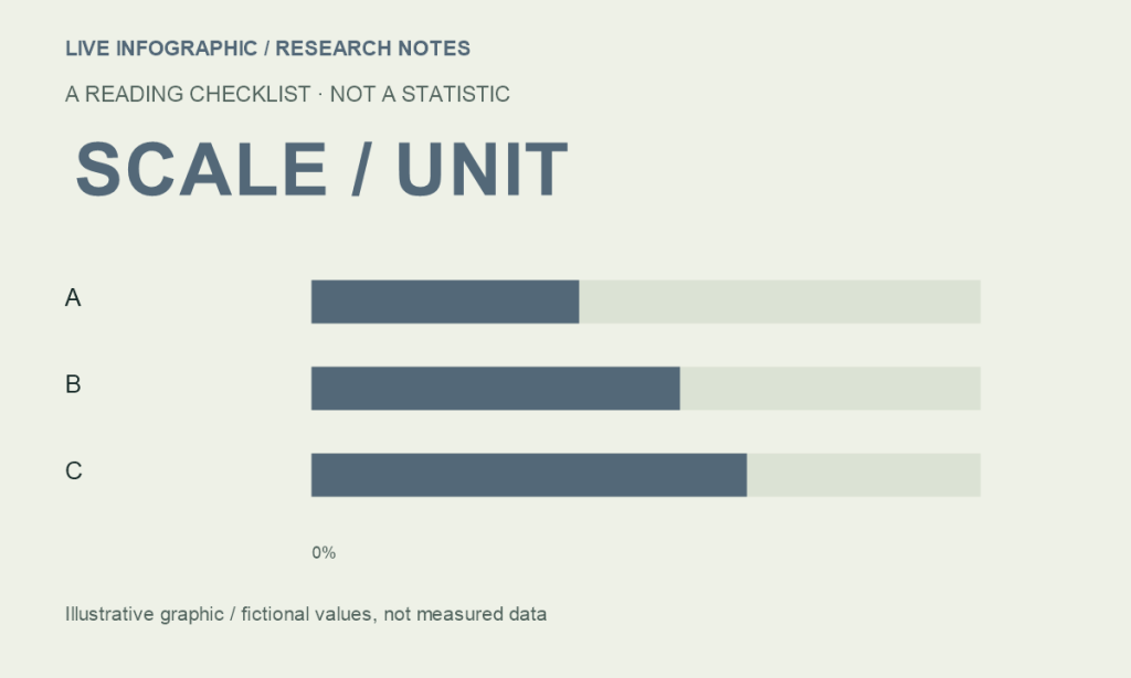
A chart is an argument made with position, length, color and labels. Before accepting the argument, inspect how those choices represent the underlying numbers.
Start with the scale
The Office for National Statistics recommends a zero baseline for bar and area charts because their filled lengths or areas encode size. A line chart may use a different starting point when the purpose is to show variation, provided the scale is clear. Comparable charts should use consistent scales.
These design rules help readers interpret values. They do not prove that every chart with a narrow line-chart range is misleading. The right question is whether the display makes the values and the comparison clear.
An invented example
Imagine two fictional groups with scores of 40 and 50. The difference is 10 points, or 25% relative to 40. If a bar chart starts at 35, the visible bar lengths are 5 and 15. The second looks three times as long even though the underlying score is only one-quarter higher. These numbers are illustrative, not research findings.
| Question | What to inspect |
|---|---|
| What is measured? | Unit, population and time period |
| How is size shown? | Bar length, area, position or color |
| Where does the scale begin? | Zero baseline or clearly labeled alternative |
| What is missing? | Source, uncertainty or excluded categories |
Check the unit before the trend
Totals and rates answer different questions. A large place may have more incidents in total and fewer incidents per resident. A sales chart in dollars may rise because of prices. A percentage can describe respondents, transactions or spending. The title should identify which one.
When two charts look similar, compare their axes before their shapes. Different ranges can make equal changes look unequal. A dual-axis chart can make two series seem closely related even when the choice of scales creates that appearance.
Look for what the graphic cannot tell you
- A correlation does not identify the cause.
- A sample average does not describe every person.
- A smooth line may hide volatility or missing observations.
- A point estimate may have meaningful uncertainty.
- A truncated time period may omit the earlier context.
Try stating the chart’s claim in one sentence without mentioning color or shape. If that is difficult, the design may be clearer than the question it is meant to answer.
Make the information survive the picture
A well-labeled table or brief text description gives readers another way to inspect the values. It also helps when the graphic is viewed on a small screen or with assistive technology. The chart should explain the story; the underlying numbers should remain available.
For an example where the adjustment label matters as much as the percentage, read our guide to e-commerce share.
Source & methodology
Office for National Statistics · Axes and gridlines. Source checked October 6, 2026. Figures are attributed to the stated period; this is an explainer, not a live data feed. Interpretation and illustrative examples are identified in the text.
See our editorial policy for sourcing and corrections.